
Currently a significant percentage of website visitors are using small devices, mobile phones and tablets. At the same time desktop screens may be large. Flat screens of 22" - 30" are available and affordable.
- Small device usage is predicted to increase and within a few years will exceed laptop/desktop usage.
- Small devices lack processing grunt and may rely on 3G data transfer so page loading needs to be fast (pages must be lean).
- Small devices do not usually have a mouse so the concept of "hovering" is not available. One implication of this is that drop down menus will not work so site navigation must be designed appropriately.
- Having a "fixed width" design may not be the best option considering the variation in the size of viewing devices being used.
- Recent CSS and HTML5 standards provide features (media queries) so that the designer can change what is shown to the visitor depending on their screen size.
This site uses a fluid (or liquid) layout so that the display adjusts according to the screen size in use. If you are viewing this on a laptop or desktop try altering the browser size to see how things change as the width decreases.
Please contact us if you would like to discuss these issues, maybe its time for a redesign?
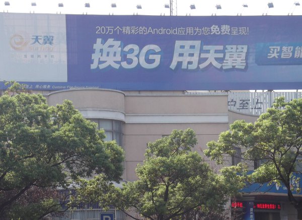
They even have Android phones in China!
English
Tag(s):